So, we have now covered the majority of the process to create a digital product to sell. If you are following along, you should now have everything fully written.
However, have you ever created something genuinely useful, priced it fairly, uploaded it with hope… and then heard absolutely nothing?
No sales. No excitement. No sign that anyone saw the value you knew was in there.
That experience is more common than people admit. And often, the problem is not the content itself.
It is the presentation.
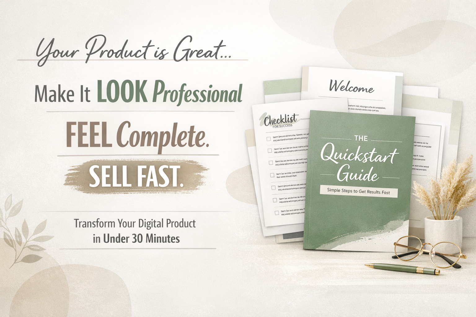
A lot of digital products go unsold not because the ideas are weak, but because the product looks unfinished. It feels more like a rough Google Doc than something polished and worth paying for. And whether we like it or not, people make fast decisions based on how something looks.
If it feels thrown together, they assume the thinking behind it was thrown together, too.
So in this article, I want to walk you through a simple five-step process that can help you take a rough draft and turn it into something that looks professional, feels complete, and is much easier to sell. And the best part is that this does not need to take all day. You can do it in under 30 minutes.
Let’s start with something people often skip.
Step One: Plan the Layout
When most people finish writing, they jump straight into formatting. They start changing fonts, moving things around, adding colours, maybe opening Canva and hoping inspiration appears.
That usually creates more confusion than clarity.
Before you design anything, you need a simple plan.
Think about the buyer experience. If someone opens your PDF for the first time, what do they need to see? What would make the product feel easy to follow and worth the price?
A polished short PDF usually needs a few core parts. A strong cover page. A short introduction or “start here” page. Clear section headers. Maybe a quick-start checklist. And a final page that tells the reader what to do next.
That structure alone can make a huge difference.
You do not have to figure it out from scratch, either. You can use a prompt like this:
“Give me a clean, professional layout plan for a short PDF product called [TITLE]…”
From there, you can build something that feels complete instead of cobbled together.
Step Two: Strengthen the Section Headers
Now let’s talk about section headers.
This is one of those small details that changes the whole feel of a product.
A lot of headers are technically fine. They do the job. But they sound flat. They sound like labels, not invitations.
And when a reader is scanning your PDF, those headers are doing more work than you think. They shape momentum. They signal value. They make the product feel either basic or considered.
For example, there is a difference between a section called “How to Start” and one that feels more benefit-led or curiosity-driven. One tells you what the section is. The other makes you want to read it.
That is why it helps to go back and rewrite your headers after the first draft is done.
Ask for headers that feel more compelling. More purposeful. More engaging.
It is a simple upgrade, but it gives the whole product more energy.
Prompt: “Rewrite these section headers to feel more compelling, benefit-driven, and curiosity-generating. They should make the reader want to keep reading, not just describe what the section contains. Here are the current headers: [LIST THEM]”
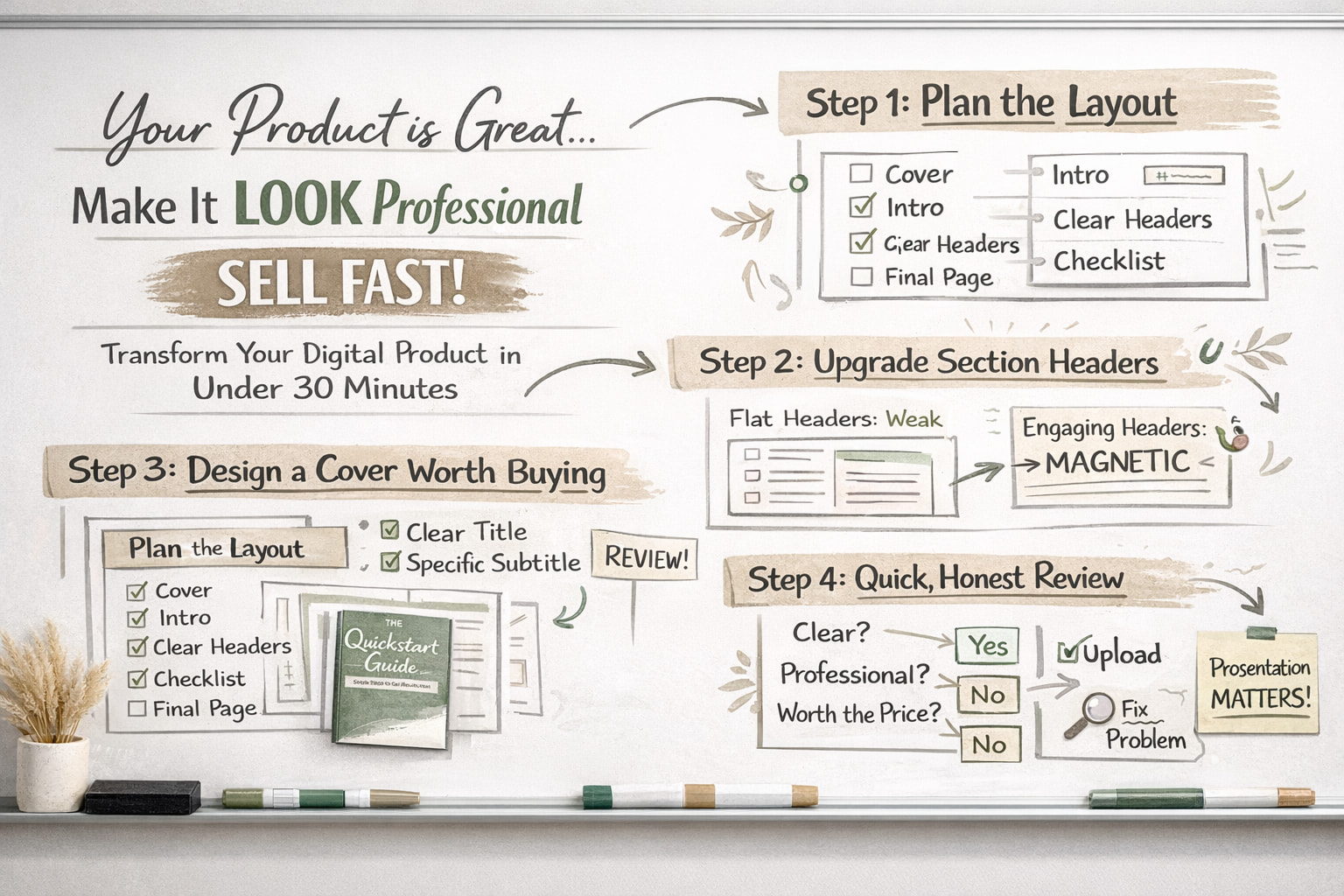
Step Three: Design a Cover That Feels Worth Paying For
Now here is the part people tend to overcomplicate.
The cover.
Some people spend hours on it. Others throw something together in five minutes and wonder why the product still feels cheap.
The goal is not to make it flashy. The goal is to make it feel clear, modern, and intentional.
A strong cover tells the buyer, “This is finished. This is real. This is worth your attention.”
Canva is perfect for this, especially if you want something quick and clean. But before opening templates, it helps to get a creative direction first.
Ask for a short design brief. Something that gives you a visual concept, a colour palette, font direction, and an overall mood.
That way, you are not just scrolling through templates in a mild creative panic. You are choosing with purpose.
Then pick a template that roughly fits, swap in your text, adjust the colours, and stop there.
Seriously. Stop there.
This should take about 15 minutes. Not two hours, not your whole afternoon, not your remaining will to live.
Prompt: “Describe a bold, modern PDF cover design for a product called [TITLE] on the topic of [TOPIC]. Suggest: a simple visual metaphor or background concept, a colour palette that feels professional and current (not corporate or dated), font weight and style direction, and how to use whitespace to make it feel premium. No clip art. No stock photo clichés. Think clean and confident.”
Step Four: Write a Subtitle That Actually Sells the Product
Let’s talk about the subtitle, the part many people ignore.
A weak or missing subtitle leaves too much work for the buyer. They should not have to guess what the product is, who it is for, or why it matters.
A good subtitle clears that up fast.
It supports the title. It adds context. It gives the product a sharper promise.
If your title is catchy but vague, the subtitle is what grounds it. It tells the buyer what they are getting and what result they can expect.
This is especially useful if your audience is busy, distracted, or scrolling quickly, which is to say, most people on the internet.
Keep it short. Keep it specific. Make it do real work.
Prompt: "Write 5 subtitle options for [PRODUCT TITLE]. Each should clarify what the product is, who it’s for, and what result they’ll get. Keep them under 12 words. Make them feel specific, not generic."
Step Five: Export and Check It as a Buyer Would
Once everything looks done, export it as a PDF.
Then do one more thing before you upload it.
Open it fresh and look at the first two pages as though you are the customer.
Not the creator. Not the person who knows what you meant. The buyer.
Ask yourself a few honest questions.
Does this look worth the price?
Is it immediately clear what this is and who it is for?
Would I feel confident sending this to a customer or recommending it to a friend?
If the answer is no, do not spiral. Do not rebuild the whole product from scratch.
Just find the specific issue.
Maybe the title is unclear. Maybe the cover feels plain. Maybe the opening page needs a cleaner introduction.
Fix the one thing that is weakening the whole experience.
That is usually enough.
Closing
So that is the full process.
Plan the layout. Strengthen the headers. Design a cleaner cover. Write a better subtitle. Then export and review it with fresh eyes.
None of this is about pretending your product is something it is not. It is about presenting your work in a way that matches the value already inside it.
Because people do judge what they see first. Annoying, shallow, extremely human behaviour. But useful to understand.
And when your product looks polished, buyers are far more likely to trust it, buy it, and feel good about what they purchased.
At the end of this process, what you have is not just a nicer-looking PDF.
You have a product that feels ready to sell.
Join me next time for the final step, as we write the sales page!